For the build team
Design system
Everything here is taken from the seal, the banner and the shirt artwork. Reuse these pieces rather than inventing new ones.
Colour
Cream
--cream
Page background
Cream deep
--cream-deep
Alternating sections
Brick
--brick
Primary, headlines, CTA
Ochre
--ochre
Kickers, dashed rules
Navy
--navy
Body text, illustration
Type
Archivo Black — display
Bowlby One SC — shirt accents
Barlow Condensed — labels and kickers
Barlow — body copy, 16px minimum, 1.6 line height.
Buttons
Badges & rules
NewBestsellerLimitedGift Pick
◆
Product card
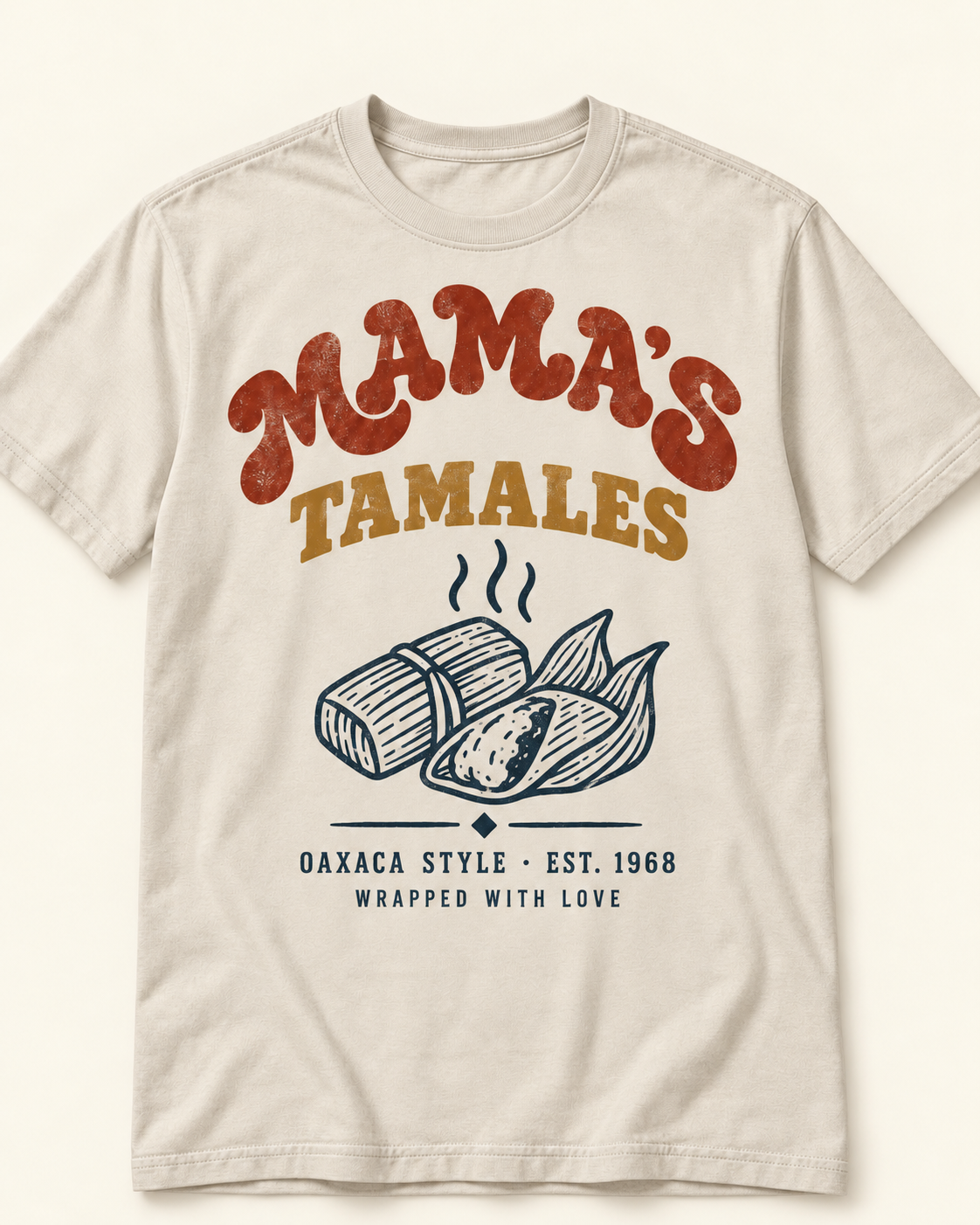
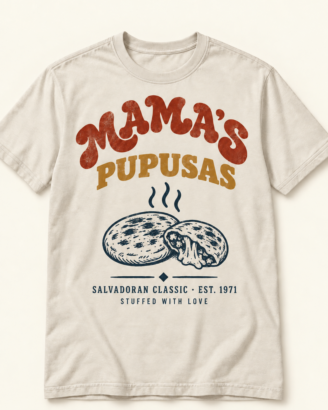
Print detail
Two-ink screen print · brick & harvest on natural cotton
BestsellerGift Pick
Hover swaps the flat-lay for the lifestyle shot. Badges sit top-left, never over the print.
Review card
★★★★★
"Sample review copy — placeholder text shown to specify the review card layout, star display and length limits."
Forms
Accessibility rules
- · Body text is navy on cream — contrast above 7:1. Never ochre on cream for text.
- · All tap targets are at least 44×44px, including filter chips and size buttons.
- · Focus is a 3px brick outline with 2px offset, never removed.
- · Product images carry descriptive alt text; hover/lifestyle duplicates are decorative.
- · Filters are real buttons with aria-pressed; sort is a native select.
- · Accordions use details/summary so they work without JavaScript.